HTML Coding Standard
Since 4.6.0, HTML source code is restructured, defined by coding standard:
- Help developer re-use layout component without writing more HTML source code, defining more CSS, even without writing javascript code.
- Help developer create component that look consistency with another.
- It's easy to maintenance and flexible to continue customizing.
FORM Component
In this guide, we introduce how to create layout for standard html form components
- Form group and form control
- Label with class .required
- Help block for form-control
Since 4.6.0, form component was re-structured to separating row by row, each row contain one
element such as email, username, etc.
In order to define a form element:
- Wrap element in
<div class="form-group">...</div> - Add a label for element by
<label for="title">Label</div> - Put field input/select/textarea, ... into form group, in most of case it must contain class
form-control. - If field is required, do not forgot add class
required to label element. - If element contain note/description, put text into
<div class="help-block">
For more information, read Bootstrap 3 form style http://getbootstrap.com/css/#forms
Examples:
Text field
| Code Block |
|---|
| actionscript3 |
|---|
| actionscript3 |
|---|
|
<div class="form-group">
    <label for="title" class="required">{_p var='what_are_you_selling'}</label>
    <input class="form-control" type="text" name="val[title]" value="" id="title" maxlength="100" />
    <div class="help-block">[Your note here]</div>
</div>
|
Password field
| Code Block |
|---|
| actionscript3 |
|---|
| actionscript3 |
|---|
|
<div class="form-group">
    <label for="title" class="required">Password</label>
    <input class="form-control" type="text" name="val[password]" value="" id="title" maxlength="100" />
    <div class="help-block">[Your password note here]</div>
</div>
|
Textarea
| Code Block |
|---|
| actionscript3 |
|---|
| actionscript3 |
|---|
|
<div class="form-group">
    <label for="mini_description">{_p var='short_description'}</label>
    <textarea id="mini_description" class="form-control" rows="3" name="val[mini_description]">{value type='textarea' id='mini_description'}</textarea>
</div>
|
Select Box
| Code Block |
|---|
| actionscript3 |
|---|
| actionscript3 |
|---|
|
<div class="form-group">
    <label for="category">{_p var='short_description'}</label>
    <select name="" class="form-control">
        <option>...</option>
    </select>
</div>
|
Checkbox (inline)
| Code Block |
|---|
| actionscript3 |
|---|
| actionscript3 |
|---|
|
<div class="form-group">
    <label>Enable payment?</label>
    <label class="radio-inline">
        <input type="checkbox" name="val[is_sell]" value="1" /> Yes
    </label>
    <label class="radio-inline">
        <input type="checkbox" name="val[is_sell]" value="0" selected='true' /> No
    </label>
</div>
|
Checkbox (multi-line)
| Code Block |
|---|
| actionscript3 |
|---|
| actionscript3 |
|---|
|
<div class="form-group">
<label for="postal_code">{_p var='enable_instant_payment'}</label>
<div class="radio">
<label>
<input type="radio" name="optionsRadios" id="optionsRadios1" value="option1" checked>
Option one is this and that—be sure to include why it's great
</label>
</div>
<div class="radio">
<label>
<input type="radio" name="optionsRadios" id="optionsRadios2" value="option2">
Option two can be something else and selecting it will deselect option one
</label>
</div>
</div>
|
Radio (inline)
| Code Block |
|---|
| actionscript3 |
|---|
| actionscript3 |
|---|
|
<div class="form-group">
    <label for="postal_code">{_p var='enable_instant_payment'}</label>
    <label class="radio-inline">
        <input type="radio" name="val[is_sell]" value="1" {value type='radio' id='is_sell' default='1'}/> {_p var='yes'}
    </label>
    <label class="radio-inline">
        <input type="radio" name="val[is_sell]" value="0" {value type='radio' id='is_sell' default='0' selected='true'}/> {_p var='no'}
    </label>
</div>
|
Radio (multi-line)
| Code Block |
|---|
| actionscript3 |
|---|
| actionscript3 |
|---|
|
<div class="form-group">
<label for="postal_code">{_p var='enable_instant_payment'}</label>
<div class="radio">
<label>
<input type="radio" name="optionsRadios" id="optionsRadios1" value="option1" checked>
Option one is this and that—be sure to include why it's great
</label>
</div>
<div class="radio">
<label>
<input type="radio" name="optionsRadios" id="optionsRadios2" value="option2">
Option two can be something else and selecting it will deselect option one
</label>
</div>
</div>
|
File upload
| Code Block |
|---|
| actionscript3 |
|---|
| actionscript3 |
|---|
|
<div class="form-group">
    <label for="exampleInputFile">File input</label>
    <input type="file" id="exampleInputFile">
    <p class="help-block">Example block-level help text here.</p>
  </div>
|
Utilities
Label
Ref: http://getbootstrap.com/components/#labels
 Image Added
| Code Block |
|---|
| actionscript3 |
|---|
| actionscript3 |
|---|
|
    <span class="label label-default">Default</span>
    <span class="label label-primary">Primary</span>
    <span class="label label-success">Success</span>
    <span class="label label-info">Info</span>
    <span class="label label-warning">Warning</span>
    <span class="label label-danger">Danger</span>
|
Table Layout
General table layout
Ref : http://getbootstrap.com/css/#tables
| Code Block |
|---|
| actionscript3 |
|---|
| actionscript3 |
|---|
|
<div class="table-responsive">
    <table class="table {feature}">
        <thead>
            <tr>
                <th>Column Name1</th>
                <th>Column Name2</th>
                <th>Column Name3</th>
            </tr>
        </thead>
        <tbody>
            <tr>
                <td>Text</td>
                <td>Text</td>
                <td>Text</td>
            </tr>
        </tbody>
    </table>
</div>
|
Supporting
- Use .table-striped to add zebra-striping to any table row within the <tbody>.
- Add .table-bordered for borders on all sides of the table and cells.
- Add .table-hover to enable a hover state on table rows within a <tbody>.
- Add .table-condensed to make tables more compact by cutting cell padding in half.
- Add .table-admin for styling admincp main table.
- Add .table-main for styling font-end main table.
Alert
ref: http://getbootstrap.com/components/#alerts
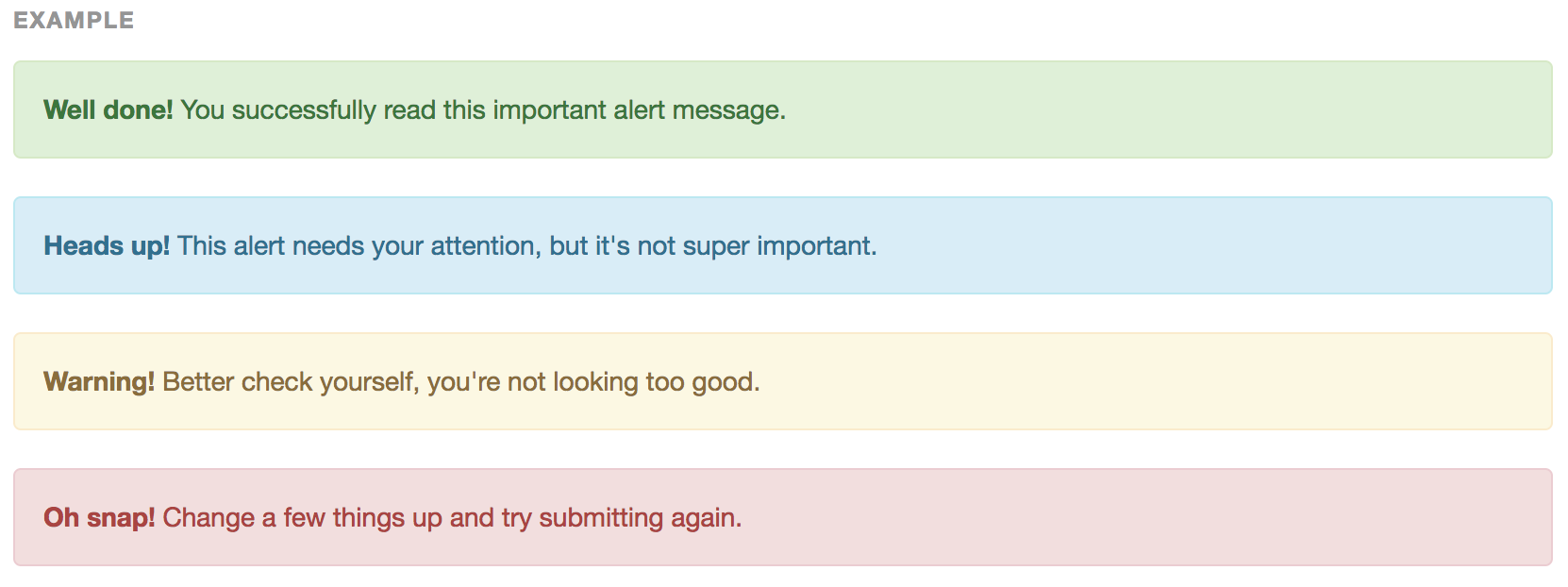 Image Added
| Code Block |
|---|
| actionscript3 |
|---|
| actionscript3 |
|---|
|
<div class="alert alert-success" role="alert">...</div>
<div class="alert alert-info" role="alert">...</div>
<div class="alert alert-warning" role="alert">...</div>
<div class="alert alert-danger" role="alert">...</div>
|
Alert with heading
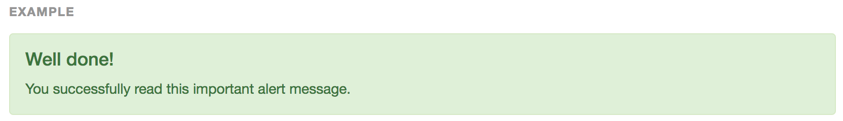 Image Added
| Code Block |
|---|
| actionscript3 |
|---|
| actionscript3 |
|---|
|
<div class="alert alert-success" role="alert">
    <h4>Requires JavaScript alert plugin</h4>
    For fully functioning, dismissible alerts, you must use the alerts JavaScript plugin.
</div>
|
Dismissible alerts
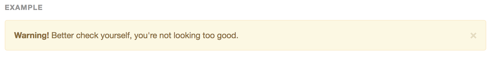 Image Added
ref: http://getbootstrap.com/components/#alerts-dismissible
| Code Block |
|---|
| actionscript3 |
|---|
| actionscript3 |
|---|
|
<div class="alert alert-warning alert-dismissible" role="alert">
<button type="button" class="close" data-dismiss="alert" aria-label="Close"><span aria-hidden="true">×</span></button>
<strong>Warning!</strong> Better check yourself, you're not looking too good.
</div>
|
Link in alert
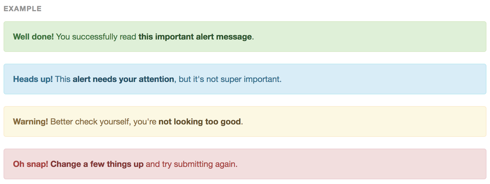 Image Added
href: http://getbootstrap.com/components/#alerts-links
| Code Block |
|---|
| actionscript3 |
|---|
| actionscript3 |
|---|
|
<div class="alert alert-success" role="alert">
  <a href="#" class="alert-link">...</a>
</div>
<div class="alert alert-info" role="alert">
  <a href="#" class="alert-link">...</a>
</div>
<div class="alert alert-warning" role="alert">
  <a href="#" class="alert-link">...</a>
</div>
<div class="alert alert-danger" role="alert">
  <a href="#" class="alert-link">...</a>
</div>
|