...
In this guide we will go over on how to create a skin for your template and use Material template by using Material template as an example.
In source code of Material template, we begin with theme.json. We notice that there is a new variable skin in vars section.
...
| Code Block | ||||||
|---|---|---|---|---|---|---|
| ||||||
{
    "id": "material",
    "name": "Material",
    "version": "4.7.0",.
    "vars": {
        "skin": {		// Define a skin section in Theme Management
            "title": "Skins",	// Define the title for skin section
            "value": "default",
            "options": [	// Define the options (color skins) for your template
                {
                    "value": "default",		// Define the skin set - The value here has to be unique
                    "label": "Default",		// Define the name of the skin set
                    "primary": "#2681D5"	// Define the primary color of the skin set
                },

				// Below are other skin sets with the same settings to Default skin
                {
                    "value": "deep_red",
                    "label": "Deep Red",
                    "primary": "#ac1a2f"
                },
                {
                    "value": "deep_purple",
                    "label": "Deep Purple",
                    "primary": "#5a2d81"
                },
                {
                    "value": "celtics",
                    "label": "Celtics",
                    "primary": "#2eff85"
                }
            ],
            "type": "skin",
            "id": "",
            "attr": ""
        },
... |
...
| Code Block | ||||
|---|---|---|---|---|
| ||||
@skin: default;
@brand-primary: #2681D5;
@brand-success: #47C366;
@brand-info: #6895B5;
@brand-warning: #FFAB00;
@brand-danger: #EE5A2B;
@body-bg: #e5eaef;
@links-color: #2681D5;
@links-color-hover: #1e67aa;
@header-bg: #ffffff;
@content-bg: #ffffff;
@nav-bg: #2681D5;
@nav-link-color: #bbd8f3;
@nav-link-color-hover: #ffffff;
@input-bg: #FFF;
@input-color: #555;
@block-bg: #FFF;
@block-title-color: #555;
@block-border-color: #eee;
@footer-bg: transparent;
@footer-color: #7691a3;
|
You can define here the color for every component of the skin in your own taste. Now you already have skins for your template.
...
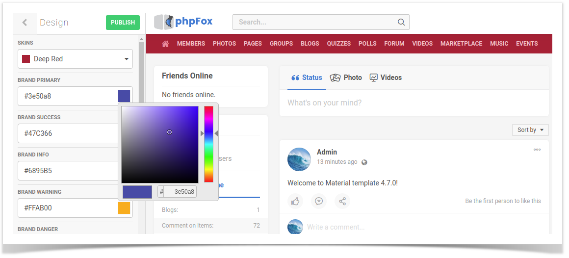
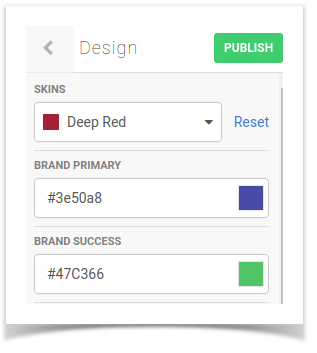
You can select your preferred skin color set from the drop down here to preview the changes. Here we select Deep Red as example for instance.

Select on Publish to apply the color skin set to your site.
...
| Note |
|---|
You might notice that in the preview on the left side, some components don't change the color as in the set accordingly. This is because in the preview only apply applies color styles on basic template components, but not on advanced components. However, once you Publish to change skin, all the color style will be applied correctly without any issue. |
| Info |
|---|
1. In case you wish to change the color of a component in a pre-defined set, you can change directly by selecting a different color on on certain component as normal.
Hit Publish the color set will save the newly chosen color on that component to that skin.
2. In case you customized color on a skin and you want to revert back to the original skin style, you can select that skin.
Here with the customized skin, another Reset button is available here to revert the current color set to the original set. |
Select on Publish button to save changes. |